


Have you ever stopped to think about the world map hanging on your classroom wall or the one you pull up on your phone? That familiar picture of continents and oceans is a powerful tool, a piece of art, and a snapshot of history all rolled into one. In German, this is called a weltkarte, and its story is as vast and varied as the planet it represents. A weltkarte isn’t just about geography; it’s about how we see our place in the world, how we’ve explored it, and how our understanding has evolved over centuries. From ancient clay tablets to interactive digital globes, the journey of the weltkarte is a fascinating exploration of human curiosity, discovery, and innovation.
This article will guide you through the incredible world of the weltkarte. We will journey back in time to see the first attempts at mapping the globe, explore the different ways a round planet can be shown on a flat surface, and see how technology is changing maps forever. You’ll discover why every map tells a story and how a simple weltkarte can inspire adventure and a deeper connection to our global community.
Key Takeaways
- What is a Weltkarte?: “Weltkarte” is the German word for “world map.” It represents our planet’s landmasses and oceans on a flat surface.
- Historical Evolution: The concept of a weltkarte has evolved dramatically, from early Babylonian clay tablets to the highly accurate satellite-based maps of today.
- The Projection Problem: It’s impossible to perfectly represent a 3D sphere on a 2D surface. All map projections, like the Mercator and Peters, have distortions and compromises.
- Cultural Significance: A weltkarte is more than a tool; it reflects the culture, politics, and knowledge of the time it was made. Map centers and scales can reveal different worldviews.
- Modern Innovations: Digital technology has revolutionized the weltkarte, offering interactive, customizable, and real-time maps through platforms like Google Maps.
The History of the Weltkarte: From Ancient Ideas to Modern Maps
The story of the weltkarte begins long before we had satellites or even ships capable of circumnavigating the globe. Early civilizations created maps based on their known world, which was often a small fraction of the planet. One of the earliest known examples is the Babylonian Map of the World, a clay tablet from around 600 BCE. This ancient weltkarte depicts Babylon at the center, surrounded by a few other regions and an ocean, showing a worldview limited by direct experience and myth. The ancient Greeks were the first to apply a more scientific approach. Thinkers like Pythagoras and later Aristotle correctly theorized that the Earth was a sphere. This revolutionary idea laid the groundwork for future mapmakers.
Early Greek and Roman Contributions
Eratosthenes, a Greek mathematician, was one of the first to create a weltkarte using a system of grid lines, similar to latitude and longitude. He also famously calculated the circumference of the Earth with surprising accuracy. Later, the Roman scholar Ptolemy wrote “Geographia,” a comprehensive work on cartography that became the standard for over a thousand years. His version of the weltkarte included thousands of locations with coordinates, but it also contained significant errors, such as underestimating the size of the oceans, which would later influence explorers like Christopher Columbus. These early maps show a blend of scientific observation and philosophical ideas about the world’s structure.
The Age of Discovery and the Weltkarte
The Age of Discovery in the 15th and 16th centuries completely transformed the weltkarte. As European explorers sailed to new lands, maps had to be redrawn constantly. The discovery of the Americas required a total rethinking of the globe. Cartographers like Martin Waldseemüller were at the forefront of this change. In 1507, he created a groundbreaking weltkarte that was the first to use the name “America” for the newly discovered continents. This era was a golden age for cartography, where maps were not just navigational tools but also valuable political documents that declared ownership over new territories. Each new voyage added another piece to the puzzle, slowly filling in the blank spaces on the world map.
Understanding Map Projections: The Flat Planet Problem
One of the biggest challenges in creating a weltkarte is something called the “projection problem.” Imagine trying to flatten an orange peel without tearing or stretching it—it’s impossible. The same issue applies to representing our spherical Earth on a flat piece of paper or a screen. Every flat map of the world is a projection, and every projection has distortions. This means that either the shape, area, distance, or direction on the map is not entirely accurate compared to the real world. Understanding these distortions is key to reading any weltkarte correctly.
The Famous Mercator Projection
Perhaps the most famous—and controversial—weltkarte projection is the Mercator projection, created by Gerardus Mercator in 1569. It was designed for sailors because it preserves direction as straight lines, making navigation at sea much easier. However, to achieve this, it dramatically distorts the size of landmasses as you move away from the equator. On a Mercator map, Greenland appears to be the same size as Africa, when in reality, Africa is 14 times larger. This has led to criticism that the Mercator projection gives a Eurocentric view of the world, making northern continents appear larger and more significant than they are.
Other Notable Weltkarte Projections
To address the issues of the Mercator projection, cartographers have developed many other ways to create a weltkarte. Each one prioritizes different features, trading one type of accuracy for another.
- Gall-Peters Projection: This projection aims to show the area of countries accurately. When you look at a Peters weltkarte, the relative sizes of continents are correct. This gives a very different visual impression, with Africa and South America appearing much larger than on a Mercator map. However, the shapes of the continents are distorted.
- Winkel Tripel Projection: Since 1998, the National Geographic Society has used the Winkel Tripel projection for its world maps. It was chosen because it offers a good balance between minimizing distortions of area, direction, and distance. It’s considered a compromise projection that provides a more realistic and visually appealing view of the globe.
Here is a table summarizing these common projections:
|
Projection |
Main Advantage |
Main Disadvantage |
Best Use |
|---|---|---|---|
|
Mercator |
Preserves direction; great for navigation. |
Distorts area, especially near the poles. |
Sea navigation, online maps where direction is key. |
|
Gall-Peters |
Shows area accurately. |
Distorts shape and angles. |
Thematic maps showing global data (e.g., population density). |
|
Winkel Tripel |
Good compromise on area, shape, and distance. |
Minor distortions in all aspects. |
General reference and educational world maps. |
There is no single “best” weltkarte. The right map depends on what you want to use it for. For a deeper dive into unique map designs, resources like those found at https://siliconvalleytime.co.uk/ can offer fascinating insights into modern cartography.
The Cultural and Political Power of a Weltkarte
A weltkarte is never just a neutral depiction of the world. It is a product of its time and culture, reflecting the knowledge, beliefs, and biases of its creator. The choices made in designing a map—what to place at the center, what names to use for places, and which projection to apply—can have powerful political and cultural implications. For centuries, most world maps produced in Europe placed Europe at their center. This “Eurocentric” view naturally made the continent appear to be the center of the world. However, this is just one perspective.
Maps from other parts of the world offer different viewpoints. For example, a Chinese-made weltkarte might center on China and the Pacific Ocean. An Australian map is often shown with the South Pole at the top, challenging our usual “north is up” orientation. These alternative maps remind us that there is no “correct” way to orient the globe. The choice of what goes in the middle or what is at the top of the map can subtly influence our perception of importance and power. A weltkarte can be a political statement, reinforcing a nation’s view of itself and its place in the global order.
Types of Weltkarte and Their Uses
Beyond the standard physical or political map, there are many different types of weltkarte, each designed to show specific information about our world. These thematic maps are powerful tools for understanding complex global patterns.
Physical Weltkarte
A physical weltkarte focuses on the geography of the planet. It shows natural features like mountains, rivers, deserts, and forests. These maps often use different colors and shading to represent elevation and terrain. For example, green might be used for low-lying plains, while brown indicates high mountains. A physical weltkarte is essential for geologists, environmental scientists, and anyone interested in the Earth’s natural landscapes. It helps us understand why cities develop where they do and how physical barriers like mountain ranges have shaped human history.
Political Weltkarte
This is the most common type of weltkarte you’ll find in an atlas or a classroom. A political weltkarte shows international boundaries, countries, and major cities. It uses different colors to distinguish one country from another, making it easy to see where one nation ends and another begins. These maps are constantly changing as borders shift due to wars, treaties, or political agreements. They are crucial for understanding international relations, geopolitics, and current events. A political weltkarte is a snapshot of the world’s political structure at a specific moment in time.
Thematic Weltkarte
Thematic maps are designed to display data on a specific topic. The possibilities are nearly endless. You can find a weltkarte that shows:
- Population density: Highlighting which parts of the world are most crowded.
- Climate zones: Mapping out tropical, arid, and polar regions.
- Economic data: Showing GDP per capita or major trade routes.
- Language distribution: Illustrating where different languages are spoken.
- Internet connectivity: Visualizing how the digital world is spread across the globe.
These maps take complex data and make it visual and easy to understand. They are invaluable tools for researchers, policymakers, and students trying to grasp global trends.
The Weltkarte in the Digital Age
The arrival of computers and the internet has completely revolutionized the weltkarte. We have moved from static, printed maps to dynamic, interactive digital ones. This shift has changed not only how maps are made but also how we use them in our daily lives. Digital maps are more accessible, personal, and up-to-date than any paper map could ever be. This technological leap has put a powerful weltkarte in the pockets of billions of people around the world.
From Paper to Pixels
The transition began with digital atlases on CDs in the 1990s and exploded with the launch of online mapping services like Google Maps and Bing Maps in the mid-2000s. These platforms combined high-resolution satellite imagery, street-level data, and powerful search functions to create an entirely new kind of weltkarte. Suddenly, you could zoom from a view of the entire planet down to your own house in seconds. You could get turn-by-turn directions, explore remote locations virtually, and see real-time traffic updates. The digital weltkarte is not just one map; it’s an infinite collection of maps, data layers, and personal views.
Interactive and Personalized Maps
One of the greatest strengths of a digital weltkarte is its interactivity. You are no longer a passive viewer; you are an active user who can customize the map to your needs. You can:
- Add layers of information: Overlay traffic data, weather patterns, or public transit routes onto a base map.
- Create personal maps: Pin your favorite restaurants, plan a road trip itinerary, or share a walking route with friends.
- Explore in 3D: Use tools like Google Earth to “fly” over landscapes and see mountains and cities in three dimensions.
- View historical imagery: Some platforms allow you to see how a place has changed over time by comparing satellite photos from different years.
This level of personalization makes the digital weltkarte an incredibly useful tool for both everyday life and professional applications.
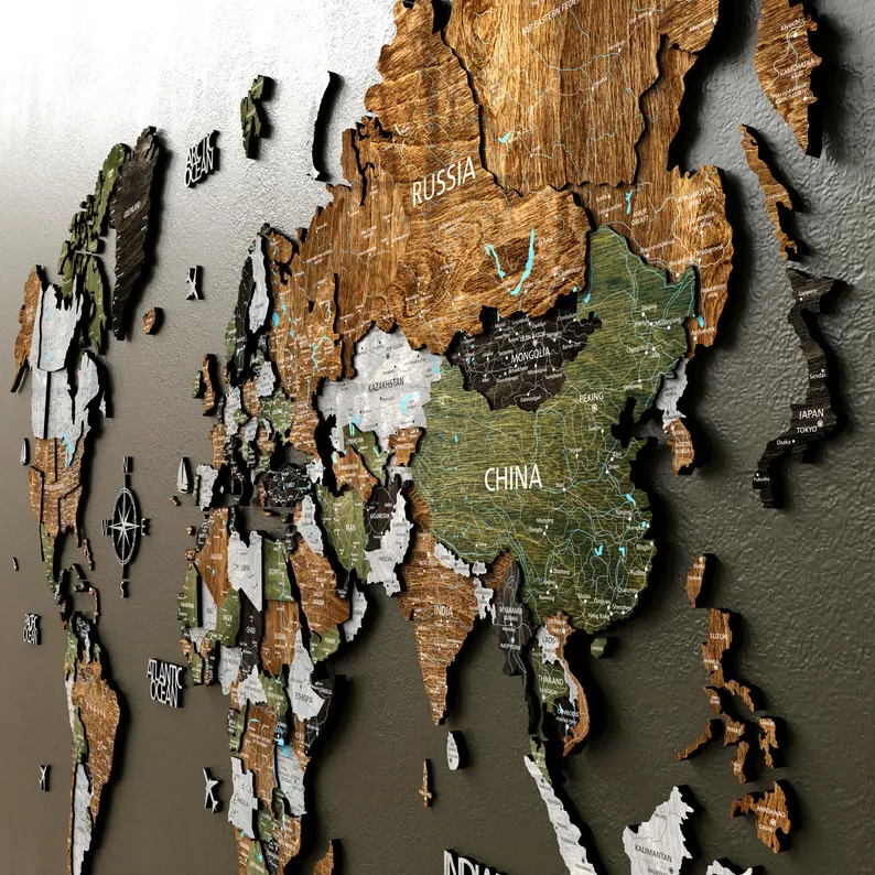
How to Choose a Weltkarte for Your Home or Office
Choosing a weltkarte to display can be an exciting process. A world map is not just a reference tool; it’s a piece of art, a source of inspiration, and a conversation starter. With so many styles and types available, how do you pick the right one? The first thing to consider is its purpose. Will it be a decorative piece for your living room, an educational tool for your children, or a functional map for planning travels? If it’s for decoration, you might prioritize aesthetics, choosing a vintage-style map or one with a unique color palette.
Next, think about the projection. As we’ve discussed, a Mercator projection is common but distorts sizes. For an educational setting or a more balanced global view, a Winkel Tripel projection might be a better choice. The size and detail of the weltkarte are also important. A large, highly detailed map can be a stunning focal point in a room, but make sure you have enough wall space. For smaller spaces, a more stylized or minimalist map might work better. Finally, consider the material. You can find a weltkarte printed on high-quality paper, canvas, metal, or even wood. Each material gives the map a different look and feel, so choose one that complements your personal style and decor.
Conclusion: The Enduring Relevance of the Weltkarte
From ancient clay tablets to the interactive globe on your smartphone, the weltkarte has been a constant companion in humanity’s quest to understand its world. It is far more than just a tool for navigation. It is a mirror reflecting our knowledge, our ambitions, and even our biases. Each map tells a story—a story of exploration, of science, of art, and of politics. The way we draw the world shapes the way we see it, influencing our perception of distance, size, and importance.
The digital revolution has not made the weltkarte obsolete; it has made it more powerful and accessible than ever before. Today’s maps are dynamic, personalized, and layered with a wealth of information that would have been unimaginable to the cartographers of the past. Yet, the fundamental wonder of the weltkarte remains. It continues to inspire curiosity, fuel our desire for adventure, and remind us that we are all part of a single, interconnected planet. Whether printed on paper or displayed on a screen, the weltkarte invites us to explore, to learn, and to see the world—and our place in it—anew.
Frequently Asked Questions (FAQ)
Q1: What does “weltkarte” mean?
“Weltkarte” is a German word that translates directly to “world map” in English. It refers to any two-dimensional representation of the Earth’s surface.
Q2: Why do all flat world maps have distortions?
All flat maps have distortions because it’s mathematically impossible to represent the surface of a sphere (the Earth) on a flat plane without stretching, tearing, or squashing some parts of it. This is known as the map projection problem. Different projections try to minimize different types of distortion.
Q3: What is the most common type of weltkarte?
The Mercator projection is one of the most widely recognized world maps. It was created for navigation and preserves direction accurately, but it severely distorts the size of landmasses near the poles, making countries like Greenland and Russia appear much larger than they are.
Q4: Is there a “best” world map projection?
There is no single “best” projection; the ideal weltkarte depends on its intended use. For sea navigation, the Mercator is useful. For comparing the area of countries, the Gall-Peters is more accurate. For general reference, compromise projections like the Winkel Tripel are often preferred because they balance different types of distortion.
Q5: How has technology changed the weltkarte?
Technology has made the weltkarte interactive, dynamic, and incredibly detailed. Digital platforms like Google Maps and Google Earth allow users to zoom, add informational layers, get real-time data like traffic, and explore the world in 3D. This has transformed maps from static objects into powerful, personalized tools for everyday life.