


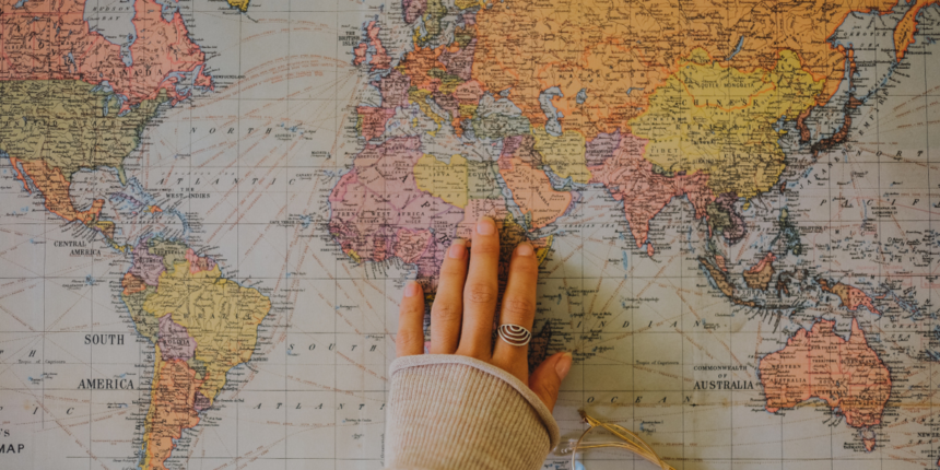
Have you ever looked at a world map and noticed how Greenland looks as big as Africa? It’s a common observation, but it’s completely wrong. This visual trickery highlights a fascinating concept: our perception of size is often distorted, whether by maps, media, or our own minds. Understanding the true size of objects, countries, and even abstract concepts is more than just a fun trivia fact; it helps us grasp the world more accurately.
This journey will explore why what you see isn’t always what you get. We will peel back the layers of distortion to reveal the actual scale of our world. From the classic map dilemma to the massive scale of digital data, prepare to have your perspective shifted. We’ll examine how these size misconceptions happen and provide tools and insights to help you see things as they truly are.
Key Takeaways
- Map Distortions: Traditional maps like the Mercator projection dramatically distort the size of countries, making those near the poles appear much larger than they are.
- Cognitive Biases: Our brains use mental shortcuts to judge size, which can often be inaccurate and influenced by context and comparison.
- Digital Scale: The true size of digital data is growing at an incredible rate, with concepts like zettabytes becoming relevant in our daily lives.
- Cosmic Proportions: Understanding the true size of planets, stars, and galaxies puts our own existence into a humbling and awe-inspiring perspective.
- Economic Realities: Visualizing the true size of corporate revenues or national debts provides a clearer picture of global economic power and challenges.
The Great Map Deception: Mercator’s Warped World
For centuries, the Mercator projection has been the standard for world maps hanging in classrooms and homes. Created in 1569 by Gerardus Mercator, it was a revolutionary tool for navigation because it preserved the angles of rhumb lines, allowing sailors to plot a straight-line course. However, this navigational benefit came at a steep cost: massive distortion of area. To represent a 3D sphere on a 2D plane, Mercator had to stretch landmasses as they got closer to the North and South Poles.
This stretching effect has profound consequences on our perception of the world. For instance, Greenland appears gargantuan, comparable in size to the entire continent of Africa. In reality, Africa is about 14 times larger than Greenland. Similarly, Alaska looks bigger than Mexico on a Mercator map, but Mexico is actually the larger country. Understanding the true size of these landmasses requires us to look beyond this popular but misleading projection. The distortion isn’t a mistake; it’s a necessary compromise for the map’s original purpose. The problem arises when this navigational tool is used as a definitive representation of geographical reality, shaping a skewed worldview for generations.
Why Does This Distortion Matter?
The Mercator map’s distortion is more than just a geographical inaccuracy; it has social and political implications. By visually inflating the size of countries in the Northern Hemisphere (predominantly Europe and North America) and shrinking those near the equator (Africa, South America, and Southeast Asia), the map inadvertently reinforces historical narratives of power and importance. This phenomenon, sometimes called “cartographic imperialism,” can subtly influence our subconscious biases about the global significance of different regions. Grasping the true size of continents helps rebalance this skewed perspective. It fosters a more accurate and equitable understanding of the world, where the immense scale of Africa and the dense populations of equatorial nations are given their proper visual due. It’s a reminder that the tools we use to see the world can also shape how we think about it.
Alternative Projections: A Fairer View
Fortunately, cartographers have developed numerous alternative map projections that offer a more accurate representation of area. The Gall-Peters projection, for example, is an equal-area map that accurately displays the relative sizes of landmasses, though it distorts their shapes. When you view a Gall-Peters map, Africa’s vastness is immediately apparent, and the exaggerated size of northern countries is corrected. Another popular choice is the Winkel Tripel projection, which offers a good compromise between minimizing distortion in area, direction, and distance. Since 1998, the National Geographic Society has used the Winkel Tripel as its standard projection for world maps. Exploring these alternatives is a powerful way to recalibrate our mental image of the planet and appreciate the true size of its diverse continents and nations.
Tools to Discover the True Size of Countries
Thanks to modern technology, you no longer have to rely on distorted paper maps. Several interactive online tools have been created to help people visualize and compare the true size of countries and continents accurately. These platforms allow you to overlay one country on top of another, providing a direct and intuitive comparison that static maps can never achieve. They are fantastic educational resources for correcting the lifelong misconceptions instilled by the Mercator projection.
One of the most popular and effective tools is a website called The True Size Of…. This simple yet brilliant site lets you type in the name of a country, which you can then drag around a world map. As you move the country’s outline away from the equator, you can see it stretch and distort just like on a Mercator map. More importantly, you can drag it over other countries to see how they really stack up. For example, you can drag the seemingly small Democratic Republic of Congo and see that it can comfortably fit most of Western Europe inside its borders. This hands-on experience offers an “aha!” moment for many users, finally making the true size of global geography click into place.
Practical Comparisons You Can Make
Using a tool like The True Size Of… unlocks countless surprising comparisons that challenge our preconceived notions. Here are a few examples to try:
- The USA and Brazil: On many maps, the mainland USA appears significantly wider than Brazil. Drag Brazil over the USA, and you’ll find they are remarkably similar in size.
- India vs. Europe: India often looks like a modest-sized country. However, its land area is vast enough to cover Spain, France, Germany, Italy, and the UK combined.
- Australia and the Moon: This one is shocking. The diameter of Australia from east to west is wider than the diameter of the Moon!
- Russia’s Real Reach: While still the largest country, Russia’s size is exaggerated on Mercator maps. Dragging it down to the equator shows it’s not quite the northern behemoth it appears to be, though it remains immense.
These comparisons are not just fun facts; they reshape our understanding of scale and distance, providing a more grounded sense of the world.
Beyond Geography: The True Size of Abstract Concepts
The challenge of understanding scale isn’t limited to maps. We often struggle to conceptualize the true size of large numbers and abstract ideas, from national debt to the amount of data on the internet. Our brains evolved to handle the numbers relevant to small-group survival—counting family members, tracking animals, or remembering seasons—not to comprehend figures in the trillions or data measured in zettabytes. This limitation is known as “psychological numeracy,” and it affects how we perceive major societal and technological issues.
For example, when a news report mentions a government spending a billion dollars, the number is so large that it becomes almost meaningless. Is that a lot? Is it a little? Without a relatable context, it’s just a word. To grasp the true size of such a figure, we need analogies. A billion seconds is nearly 32 years. If you spent $1 every second, it would take you almost 32 years to spend a billion dollars. To spend a trillion dollars at the same rate, you would need nearly 32,000 years. Suddenly, the difference between a billion and a trillion becomes tangible and staggering, allowing for a more informed perspective on economic discussions.
Visualizing the Digital Universe
The digital world provides another area where our sense of scale is completely overwhelmed. We talk about gigabytes, terabytes, and petabytes, but these terms are just labels without a proper frame of reference. Let’s try to build one.
|
Unit |
Size |
Analogy |
|---|---|---|
|
Kilobyte (KB) |
1,000 bytes |
A short email (text only). |
|
Megabyte (MB) |
1,000 KB |
One high-resolution photograph. |
|
Gigabyte (GB) |
1,000 MB |
About 7 minutes of 4K video. |
|
Terabyte (TB) |
1,000 GB |
The text of 1,000 copies of the Encyclopedia Britannica. |
|
Petabyte (PB) |
1,000 TB |
All photos uploaded to Facebook each day. |
|
Exabyte (EB) |
1,000 PB |
All words ever spoken by humans (estimated). |
|
Zettabyte (ZB) |
1,000 EB |
Total internet traffic in 2021 was roughly 3.4 ZB. |
This table helps illustrate the exponential growth in data. The true size of our collective digital footprint is mind-bogglingly vast and expanding faster than ever. Understanding this scale is crucial for appreciating the challenges and opportunities of the information age, from data storage solutions to privacy concerns. As noted in tech analysis from outlets like siliconvalleytime.co.uk, managing this data explosion is a central focus of the entire technology industry.
The True Size of Time
We also struggle to perceive the true size of deep time—the immense history of our planet and the universe. The human lifespan is a blip on this timeline. To put it in perspective, imagine the entire 4.5-billion-year history of the Earth compressed into a single 24-hour day.
- The Earth forms at midnight (00:00).
- The first simple life appears around 4:00 AM.
- Dinosaurs first appear at 10:40 PM.
- The dinosaurs go extinct at 11:39 PM.
- The entire recorded history of humanity (about 5,000 years) occurs in the last fraction of a second before midnight.
This analogy reveals the incredible newness of our species. It contextualizes evolution, geology, and our own place in the grand cosmic story. Comprehending the true size of geological time fosters a deeper respect for the planet’s long, slow processes and the profound impact our species is having in such a short period.
Cosmic Comparisons: Our Place in the Universe
If understanding global scale is challenging, then grasping cosmic scale is a whole other level of mind-bending. The universe is so vast that our standard units of measurement, like miles or kilometers, become practically useless. Instead, astronomers use units like the “light-year”—the distance light travels in one year, which is about 5.88 trillion miles (9.46 trillion kilometers). Even this enormous unit feels small when discussing the true size of galaxies.
Let’s start with our solar system. We think of planets like Jupiter and Saturn as giants, and they are—Jupiter is so big that all other planets in our solar system could fit inside it. But Jupiter is a speck compared to our Sun. You could fit about 1,000 Jupiters inside the Sun. And our Sun? It’s just an average-sized star. There are hypergiant stars like UY Scuti that are so enormous, if you placed one at the center of our solar system, its surface would extend beyond the orbit of Jupiter. Our entire planet would be just a tiny particle vaporized deep within its core.
Galaxies and Beyond
Taking another leap in scale brings us to galaxies. Our home, the Milky Way galaxy, is a barred spiral galaxy estimated to be about 100,000 light-years across. It contains between 100 and 400 billion stars, each potentially with its own system of planets. Thinking you understand the true size of the Milky Way is just the beginning. Our nearest major galactic neighbor, the Andromeda Galaxy, is about 2.5 million light-years away and is even larger, containing perhaps a trillion stars.
And that’s just our local neighborhood. The observable universe contains an estimated two trillion galaxies, clustered together in superclusters separated by vast, empty voids. The sheer scale is beyond human intuition. Visualizations and thought experiments are the only way we can begin to approach an understanding of the true size of our cosmic home. It’s a humbling exercise that underscores the preciousness and improbability of our existence on this tiny blue dot.
Conclusion: A New Perspective on Scale
From the countries on a map to the stars in the sky, the true size of things is often hidden by misleading representations and the limits of our own perception. The Mercator projection flattens and warps our world, cognitive biases prevent us from understanding large numbers, and the sheer scale of the cosmos defies easy comprehension.
However, by actively seeking out better tools, using relatable analogies, and embracing a sense of curiosity, we can break free from these distortions. Dragging a country across a digital map, comparing national debt to a timeline, or imagining Earth’s history as a single day are all powerful exercises in recalibrating our sense of scale.
Ultimately, striving to understand the true size of our world and universe does more than just correct misconceptions. It fosters humility, encourages a more equitable global perspective, and fills us with a profound sense of wonder at the intricate and immense reality we are a part of. The world is bigger, more complex, and more amazing than it first appears.
Frequently Asked Questions (FAQ)
Q1: What is the most accurate world map projection?
A: There is no single “most accurate” map, as all flat maps distort a spherical surface in some way. The best map depends on the purpose. For showing the true size of landmasses, equal-area projections like the Gall-Peters or the Mollweide are best. For a balanced view that minimizes multiple types of distortion, the Winkel Tripel projection is widely recommended and used by organizations like National Geographic.
Q2: Why do we still use the Mercator map if it’s so distorted?
A: The Mercator map remains useful for its original purpose: navigation. It preserves angles, making it easy to plot a course with a constant bearing as a straight line. It is also prevalent in web mapping services like Google Maps for local area views, where the distortion is minimal and its grid-like structure is computationally efficient. The problem arises when it’s used as a general-purpose world map.
Q3: What is the single biggest misconception about country sizes?
A: The most common and dramatic misconception is the relationship between Greenland and Africa. On a Mercator map, they look similarly sized. In reality, Africa is over 14 times larger than Greenland. This single comparison is often the gateway for people to start exploring the true size of other countries.
Q4: How can I better understand large numbers like a trillion?
A: The key is to use analogies based on time or familiar objects. For example, to grasp one trillion dollars, imagine spending $1 million every single day. It would take you over 2,700 years to spend it all. This converts an abstract number into a tangible concept tied to a human scale of time.
Q5: Is the website “The True Size Of…” accurate?
A: Yes, the website is a highly accurate tool. It uses geospatial data to create country outlines and projects them onto a web Mercator map base. By allowing you to drag the outlines, it correctly adjusts their size based on latitude, providing an accurate visual comparison of their true area relative to other landmasses. It’s an excellent resource for educational purposes.