


Data visualization is one of the most important parts of modern app development. Whether you are building a fitness tracker, a financial dashboard, or a simple weather app, you need a way to show numbers so people can understand them. This is where uCharts comes into play. It is a powerful tool designed to make drawing charts easy, fast, and beautiful across different platforms.
If you have ever struggled with making a graph look good on both an Android phone and an iPhone, or even on a simple web page, you know the pain. Developers often spend hours tweaking code just to get a line to curve the right way. uCharts solves this problem by offering a high-performance charting library that works seamlessly on multiple frameworks like UniApp, WeChat Mini Programs, and standard HTML5 canvas projects.
In this guide, we will explore exactly what uCharts is, why it has become so popular among developers, and how you can use it to upgrade your projects. We will break down complex technical terms into simple language so you can understand the power of this library, even if you are just starting your coding journey.
Key Takeaways
- Cross-Platform Compatibility: Learn how uCharts works on iOS, Android, H5, and various mini-program platforms.
- Easy Customization: Discover how simple it is to change colors, shapes, and animations.
- High Performance: Understand why this library is faster than many competitors.
- Rich Chart Types: Explore the wide variety of graphs available, from line charts to radar maps.
- Integration Tips: Get practical advice on adding this library to your code.
What Exactly is uCharts?
At its core, uCharts is a lightweight, high-performance charting library based on the HTML5 Canvas API. It was created specifically to solve the problem of cross-platform compatibility in the UniApp ecosystem. UniApp is a framework that allows developers to write code once and publish it to multiple platforms, like iOS, Android, and the Web. However, creating charts that looked the same and performed well on all these platforms was difficult until uCharts arrived.
The library is open-source, which means developers can use it for free and even contribute to its code. It is designed to be very small in file size, which is great for mobile apps where storage space and download speed matter. Unlike some heavy libraries that slow down your phone, uCharts keeps things running smoothly.
Think of it as a universal translator for graphs. You tell it what data you have—like sales figures or daily steps—and it translates that data into a visual picture that looks perfect, whether viewed on a tiny old phone or a brand-new tablet. This versatility is the main reason why thousands of developers have adopted it for their projects.
The Problem It Solves
Before tools like this existed, developers often had to use different libraries for different platforms. They might use one tool for a website and a completely different one for an Android app. This meant writing the code twice, debugging it twice, and maintaining two different codebases. uCharts unifies this process. You write your chart configuration once, and it renders beautifully everywhere.
Why Choose uCharts Over Other Libraries?
There are dozens of charting libraries out there. You might have heard of Chart.js, ECharts, or Highcharts. So, why should you pick uCharts? The biggest selling point is its specialized support for the UniApp framework and Mini Programs (like those inside WeChat or Alipay). While ECharts is powerful, it can be heavy and sometimes tricky to integrate into these specific mini-program environments.
uCharts is “native-friendly.” It doesn’t rely on heavy web views or complex DOM manipulation that can slow down a mobile app. Instead, it draws directly on the canvas component provided by the platform. This results in smoother animations and faster loading times. When a user opens your app, they want to see their data instantly, not wait for a loading spinner.
Another reason is simplicity. Some libraries require you to write hundreds of lines of code just to display a simple bar chart. uCharts is designed with a “config-first” approach. You provide a simple JavaScript object with your settings, and the library handles the rest. This makes it incredibly beginner-friendly for new developers who might be intimidated by complex data visualization.
Performance Comparison Table
|
Feature |
uCharts |
Traditional Web Chart Libraries |
|---|---|---|
|
File Size |
Very Small (< 50kb) |
Often Large (> 200kb) |
|
Mobile Speed |
Fast (Native Canvas) |
Slower (DOM based) |
|
UniApp Support |
Excellent |
Limited / Requires Adapters |
|
Learning Curve |
Low / Easy |
Medium to High |
|
Platform Reach |
Multi-terminal (App, H5, Mini Program) |
Mostly Web / H5 |
Understanding the Core Features
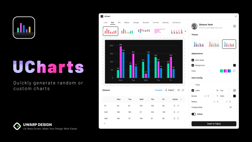
The feature set of uCharts is surprisingly robust for such a lightweight tool. It supports a wide array of chart types. You are not limited to just basic bars and lines. You can create pie charts to show percentages, ring charts for a modern look, radar charts for comparing multiple variables (like in video game stats), and even gauge charts that look like a car speedometer.
One of the standout features is interaction. Charts are not just static pictures; they are interactive. When a user taps on a specific bar or point on a line, uCharts can display a tooltip with exact numbers. This interactivity engages users and helps them explore the data on their own. You can customize how these interactions work, such as zooming in on a specific time period or scrolling through a long timeline of data.
Furthermore, the library supports customization of almost every visual element. You can change the thickness of lines, the colors of the bars, the size of the text, and the position of the legends. This allows you to match the charts perfectly to your app’s brand design. If your app uses a dark theme, uCharts can easily switch to a dark mode configuration to match.
List of Supported Chart Types
- Line Charts: Great for trends over time.
- Column/Bar Charts: Perfect for comparing categories.
- Pie & Ring Charts: Ideal for showing parts of a whole.
- Radar Charts: Used for multi-variable comparison.
- Gauge Charts: Excellent for showing progress or single metrics.
- Candlestick Charts: Essential for financial and stock apps.
- Mixed Charts: Combine bars and lines in one view.
How to Get Started with uCharts
Starting with uCharts is straightforward, especially if you are already familiar with JavaScript or the UniApp framework. The first step is usually to download the library file or install it via a package manager like npm. Once you have the files in your project, you can import them into the page where you want the chart to appear.
You will need a <canvas> element in your HTML or Vue template. This acts as the drawing board. You must give this canvas an ID so that the uCharts code knows where to draw. For example, you might call it canvasId="myChart". It is crucial to set the width and height of this canvas correctly, or your chart might look stretched or blurry.
After setting up the canvas, you write a function in your script section. This function will create a new instance of the uCharts object. You pass it the ID of your canvas, the type of chart you want (like ‘column’ or ‘line’), and the data categories and series. Once you run this function, the chart magically appears on the screen.
Basic Setup Steps
- Download: Get the
u-charts.jsfile from the official repository or plugin market. - Import: Add the script to your page.
- Canvas: Place a canvas tag in your view with a defined width and height.
- Data: Prepare your data in JSON format (Categories and Series).
- Initialize: Call the standard
new uCharts({})function with your config.
Deep Dive: Configuring Your First Chart
Let’s look closer at the configuration. The beauty of uCharts lies in its flexible configuration object. This object controls everything. The primary properties you will deal with are categories and series.
categories usually represents the X-axis labels. If you are showing sales for the week, your categories would be [“Mon”, “Tue”, “Wed”, “Thu”, “Fri”].
series represents the actual data. This is an array of objects, where each object has a name and a data array. For example: [{ name: "Sales", data: [15, 25, 30, 20, 45] }].
There are also boolean flags (true/false) that make huge changes with a single word. Want to show a legend? Set legend: true. Want the background to be transparent? Set background: '#FFFFFF'. Want animations? Just enable them. This declarative style of coding makes uCharts very readable. You can look at the code and instantly understand what the chart is supposed to look like.
Common Configuration Errors
Beginners often make mistakes with the data structure. The data array in series must match the length of categories. If you have 5 days in your categories but only 4 data points, the chart might crash or look weird. Another common issue is not giving the canvas explicit dimensions (width/height) in pixels. uCharts relies on pixel values to calculate where to draw lines and text.
Customizing the Look and Feel
You don’t want your app to look like everyone else’s. That’s why styling is important. uCharts allows for deep visual customization. You can define a color palette array. The chart will cycle through these colors for different data series. This is great for keeping your branding consistent.
You can also customize the axes. You can turn off the grid lines if you want a cleaner, minimalist look. You can change the font size of the labels to make them more readable for elderly users. You can even format the text on the Y-axis to show dollar signs, percentages, or other units.
For line charts, you can choose between straight lines or smooth curves (often called “spline”). Smooth curves generally look more modern and friendly, while straight lines look more precise and technical. uCharts gives you a simple toggle extra: { line: { type: 'curve' } } to switch between these styles instantly.
Advanced Styling Options
- Gradient Colors: Fill areas under lines with fading colors.
- Point Styles: Change the dots on a line graph to circles, squares, or triangles.
- Data Labels: Show the exact number directly on top of the bar or point.
- Tooltips: Customize the text box that appears when you touch the chart.
Handling Interactivity and Events
In a mobile app, users expect to touch things. uCharts handles touch events brilliantly. When a user touches the canvas, the library calculates the coordinates of the touch and determines which data point is closest. It can then trigger a tooltip or highlight that specific data point.
To make this work, you need to bind touch events in your view template. For example, in UniApp, you would add @touchstart, @touchmove, and @touchend listeners to the canvas tag and connect them to the uCharts event handlers. This sounds technical, but it is usually just three lines of code copy-pasted from the documentation.
You can also use these events to trigger other actions in your app. For instance, if a user clicks on the “Monday” bar in a chart, you could use that event to open a detailed report for Monday below the chart. This transforms the chart from a static image into a navigation tool for your data.
Performance Tips for Heavy Data
While uCharts is fast, rendering thousands of data points on a mobile phone can still be heavy. If you try to shove ten years of daily stock prices into a single mobile screen, it will look like a mess and run slowly.
To handle large datasets, you should use the “scroll” or “zoom” features. uCharts allows you to show a window of data (say, 30 points) and let the user scroll horizontally to see the rest. This keeps the rendering fast because the phone only has to draw what is currently visible on the screen.
Another tip is to disable animations for large datasets. Animations require the phone to redraw the chart many times per second. If you have complex data, turning off the initial animation can make the chart appear much faster. Also, avoid using too many gradients or shadows if you are targeting older, slower devices.
Optimization Checklist
- Limit Data Points: Aggregate data if possible (e.g., show weekly instead of daily).
- Enable Scrolling: Don’t squeeze everything into one view.
- Simplify Visuals: Disable gradients and shadows on low-end devices.
- Lazy Loading: Only render the chart when the user scrolls it into view.
Common Mistakes to Avoid
Even experienced developers can trip up. One specific issue with uCharts relates to the pixel ratio. Modern phones have “Retina” or high-density displays. If you just draw a 300×200 chart, it might look blurry on an iPhone. uCharts has a pixelRatio setting that you should set (usually to the device’s pixel ratio) to ensure crisp, sharp lines.
Another mistake is forgetting to handle empty data. If your API returns no data (null or empty array), passing this directly to uCharts might cause an error. You should always check your data before creating the chart and perhaps show a “No Data Available” message instead of a broken empty canvas.
Finally, scope management is tricky in JavaScript frameworks. Ensure that your chart instance variable is stored correctly in your component’s data so you can access it later to update the chart (e.g., when the user applies a filter). If you lose the reference to the chart instance, you can’t update it without redrawing the whole thing from scratch.
Integrating with Backend APIs
In the real world, your data usually comes from a server. You will fetch data using an API call. Since uCharts runs on the client side (the user’s phone), you need to fetch the data first, format it, and then tell the chart to update.
The typical flow is:
- Load the page with an empty chart or a loading spinner.
- Make an asynchronous request (AJAX/Fetch) to your server.
- Receive the JSON data.
- Process the data into
categoriesandseriesarrays required by uCharts. - Call the
updateData()method on your chart instance.
This dynamic updating is seamless. You can even create buttons that switch the data view (e.g., “Last 7 Days” vs “Last 30 Days”). When the button is clicked, you fetch new data and update the chart, providing a responsive and fluid user experience.
The Future of Mobile Charting
As mobile devices become more powerful, libraries like uCharts will likely gain even more features. We might see support for 3D charts or more complex animations in the future. However, the core philosophy will likely remain the same: lightweight, fast, and cross-platform.
The demand for data visualization is only growing. Apps are tracking more health data, financial data, and usage stats than ever before. Users are becoming more data-literate; they expect to see graphs and trends, not just raw numbers. Mastering a tool like uCharts is a valuable skill for any frontend developer working in the mobile space today.
For developers looking to stay ahead in the tech world, keeping an eye on updates from the uCharts community is essential. New plugins and wrappers are constantly being released to make integration with newer frameworks like Vue 3 even easier.
Speaking of staying ahead in the tech world, for the latest updates on technology trends and developer tools, you might find valuable insights at https://siliconvalleytime.co.uk/. Keeping your knowledge base current is just as important as writing clean code.
Conclusion
uCharts stands out as a premier solution for developers needing reliable, high-performance charting in cross-platform environments. Its focus on the UniApp ecosystem fills a crucial gap, allowing for native-like performance without the headache of managing multiple codebases. From its tiny file size to its rich customization options, it respects both the developer’s time and the user’s device resources.
By using uCharts, you ensure that your data tells a story that is beautiful, interactive, and accessible to everyone, regardless of the device they are using. Whether you are building a simple hobby project or a complex enterprise dashboard, this library provides the tools you need to succeed.
For more general information on the history and technical details of charting libraries similar to uCharts, you can read this entry on https://www.wikipedia.org/.
FAQ
Q: Is uCharts free to use for commercial projects?
A: uCharts is generally open-source, but you should always check the specific license file (usually Apache 2.0 or MIT) in the repository to be sure it fits your commercial needs.
Q: Can I use uCharts with React or Angular?
A: While uCharts is optimized for UniApp and Vue.js environments, the core logic is based on Canvas. However, integrating it into React might require more manual setup than using it with Vue/UniApp.
Q: My chart looks blurry on my iPhone. How do I fix it?
A: You likely need to adjust the pixelRatio. Set it to uni.getSystemInfoSync().pixelRatio in your configuration to ensure it uses the full resolution of the screen.
Q: Does uCharts support zooming and panning?
A: Yes, it supports touch interaction including zooming and scrolling, especially for charts with a lot of data on the X-axis. You need to enable these features in the configuration.
Q: Can I export the chart as an image?
A: Since uCharts draws on a canvas, you can use the standard canvas toDataURL or UniApp’s canvasToTempFilePath method to save the chart as an image file.